
Project documentation
Planning & design.
How the Alaradi Dental redesign was planned, and the design decisions behind it.
01Project planning
The project followed a research-first process. No page was built before the clinic’s real information had been collected and the structure agreed.
- Brief
Read the IT6012 brief: seven fixed pages, a registration form with set validation rules, and documentation pages.
- Research
Collected facts from the clinic’s official website, Instagram and Google Maps listing. Nothing was invented.
- Structure
Agreed the three subtopics: Services, Doctors & Smile Gallery, and Visit Us.
- Home v1
Built the first Home page and shared code, then reviewed it.
- Redesign
Rejected v1 as too template-like and redesigned the visual language (see below).
- Pages
Built the remaining pages page by page, testing each one.
- Sources used
- alaradidental.com (services, doctors, insurance), the clinic’s Google Maps listing (address, opening hours), the clinic’s Instagram (phone numbers, newer doctors, partners), and details confirmed by the clinic owner (email, permission).
- Conflicts resolved
- Three sources disagreed on opening hours. The Google Maps schedule was chosen; the other times turned out to be one doctor’s personal booking slots.
- Excluded content
- Prices, time-limited offers, testimonials, and template leftovers on the old site (such as “Vaccine”) were left out.
02Design goals
Calm and trustworthy
A dental visit can make people anxious, so the site is light, spacious and quiet. Motion is restrained.
True to the clinic’s identity
Colours are measured directly from the clinic’s logo, and real clinic photography replaces stock images.
Contact is never hidden
The old site showed no phone number. Here, call, WhatsApp, hours and location appear on every page.
Simple to use and to explain
Plain HTML, CSS and JavaScript. The booking demo is intentionally simple, as the instructor requested.
03Wireframes
Low-fidelity wireframes were used to agree the order of sections before any styling. Wireframes for all seven pages are on the Project overview page.
-
Home, desktopFinal section order, approved before building. -
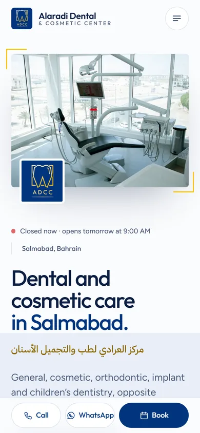
Home, mobileSingle column, photo first, sticky action bar. -
ServicesSticky group titles beside readable lists.
04Mockups & design evolution
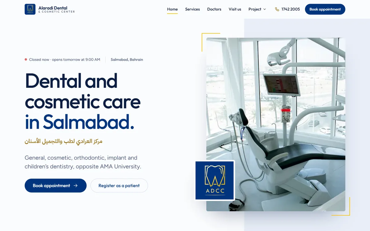
The first version of the Home page worked, but it was built from generic rounded cards on a flat navy hero. It was reviewed and rejected as looking too much like a template. The second version kept every feature and changed the visual language:
| Area | Version 1 | Version 2 (final) |
|---|---|---|
| Hero | Flat navy block with the logo | Light split layout: headline beside a real treatment-room photo, logo as an overlapping tile |
| Services | Grid of eight rounded cards | Typographic list with a photo preview that changes on hover or focus |
| Doctors | Boxed cards | Borderless portraits in a staggered row, swipeable on phones |
| Clinic info | Four white cards | One navy information bar |
| Shapes | Large rounded corners everywhere | Near-square photos, pill buttons only |
| Labels | A small label above every heading | Used on only a few sections |
05Colour palette
The navy and gold were measured from logo.jpg with a script, so the logo sits on the page without a visible box. Contrast ratios were calculated against WCAG 2.1.
- AaNavy (primary)
#01357EWhite text 11.6:1 - AaMidnight
#0A1E42Headings, footer - AaGold (accent)
#FAC007On navy 7.0:1. Never text on white (1.7:1) - AaDeep gold
#8A6400Gold text on white 5.4:1 - AaPorcelain / Slate
#FBFCFE / #4A5A78Page and body text 6.9:1 - AaIce
#E8EEF8Quiet background fields
06Typography
Outfit is a geometric sans-serif whose round, even letters echo the “A D C C” wordmark in the logo. Figtree is used for reading. IBM Plex Sans Arabic sets the clinic’s Arabic name. All three are open-source Google Fonts.
- Display, Outfit 500
clamp(2.6rem … 5rem) - Dental care
- Heading, Outfit 500
clamp(1.9rem … 3.1rem) - From routine check-ups to implants.
- Body, Figtree 400
clamp(1rem … 1.1rem) - General, cosmetic, orthodontic, implant and children’s dentistry, opposite AMA University.
- Arabic, IBM Plex Sans Arabic
- مركز العرادي لطب الأسنان والتجميل
07Layout decisions
Asymmetric, editorial grids
Sections use uneven two-column splits (for example 1.1fr / 0.9fr) instead of rows of equal boxes, and each Home section uses a different layout.
One signature detail
The logo’s open square frame is redrawn as gold corner brackets around key photos. It is the only decorative element.
Shape rule
Photos and panels have near-square corners; buttons are pills; inputs are softly rounded. Nothing else is rounded.
One dark band
The page stays light, with a single midnight section for the before/after gallery to give it focus.
09Responsive strategy
The site is fluid by default, and the instructor’s advice to prefer relative units was followed.
- Type and spacing scale smoothly with
clamp(), for exampleclamp(2.6rem, 1.7rem + 4vw, 5rem)for the main headline. - Containers use
min(100% - 2 × gutter, 78rem)instead of fixed widths. - Layout uses CSS Grid and Flexbox, with breakpoints in
em(36em, 48em, 60em, 62em, 75em). - Images use
srcset/sizes,aspect-ratioand width/height attributes to avoid layout shift. - Small fixed values stay in
pxwhere they make sense, such as 1px borders. - Tested with an automated overflow check at 320, 375, 390, 414, 768, 834, 1024, 1280, 1440, 1920 and 2560px.
10Animation & interaction
Motion with a reason
Photos uncover as they scroll into view, gold brackets draw in after them, and text rises gently. Each effect guides attention; nothing loops except the “open now” indicator and the insurer strip.
Useful interactions
The before/after slider (drag, arrow keys or buttons), the services photo preview, the section bar that tracks your position, and the booking demo.
Reduced motion respected
With “reduce motion” turned on in the operating system, every animation is switched off and all content is shown immediately.
Tactile feedback
Buttons lift slightly on hover and press in when clicked. Durations are short (90 to 360 ms, longer only for photo reveals).
11Accessibility considerations
- Colour pairs checked for WCAG AA contrast; gold is never used for text on white.
- Every form field has a visible label; errors appear under the field, are announced to screen readers, and focus moves to the first problem.
- A visible gold focus ring on all interactive elements, and a “Skip to main content” link.
- Meaningful alt text on clinic photos; decorative images use empty alt text.
- The before/after slider is a real range input, so it works with a keyboard and screen readers.
- Touch targets are at least 44px tall on phones.
12Images & assets
- All photographs are the clinic’s own, taken from its official website and Instagram and used with the owner’s permission. No stock photos are used.
- Originals are kept untouched in a separate source folder. A Python script produces the website copies.
- Website copies are WebP at 480, 800 and 1200px widths (about 1.5 MB in total), cropped to remove a small watermark icon and the clinic’s branded frames around before/after photos.
- Doctor portraits were cropped from the clinic’s Instagram announcements where no separate photo existed.
- Insurer names are shown as text rather than copying third-party logos.